… including a shift in positioning and tagline from ‘Full Service. Flexible Rates” to the more understandable “Full Service For Less.,” a refreshed logo with improved graphic elements and layout, and some exploratory design.
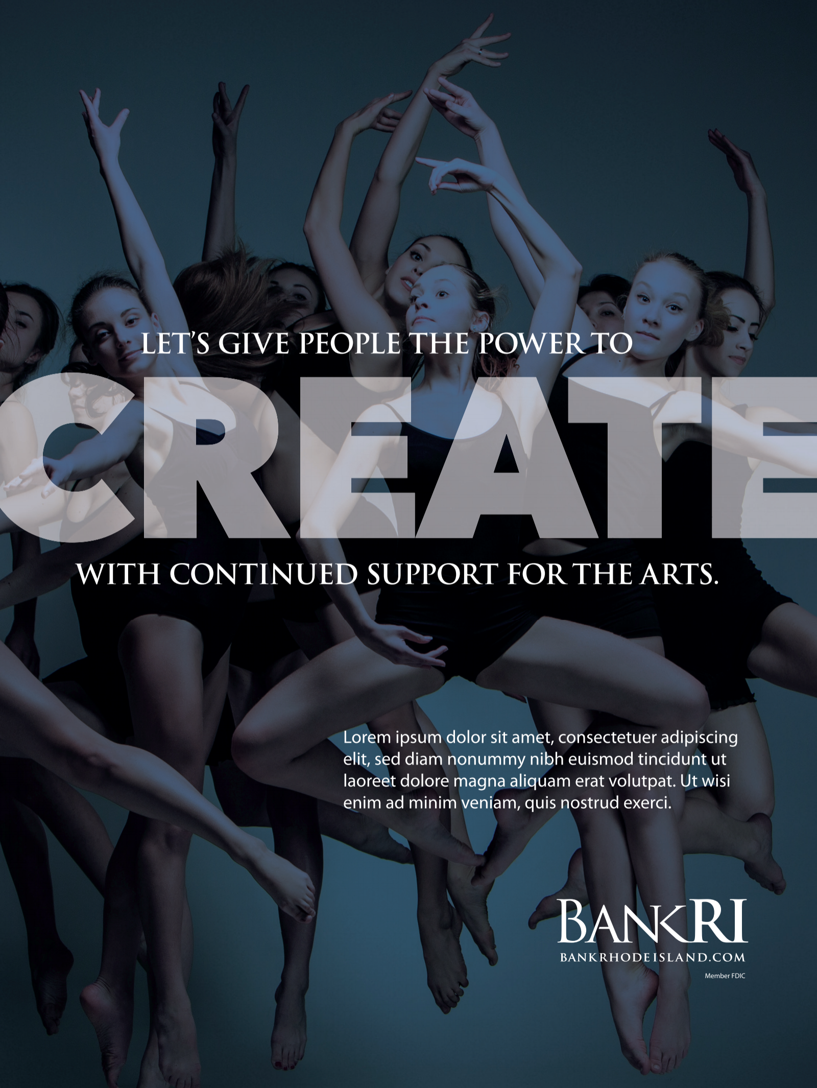
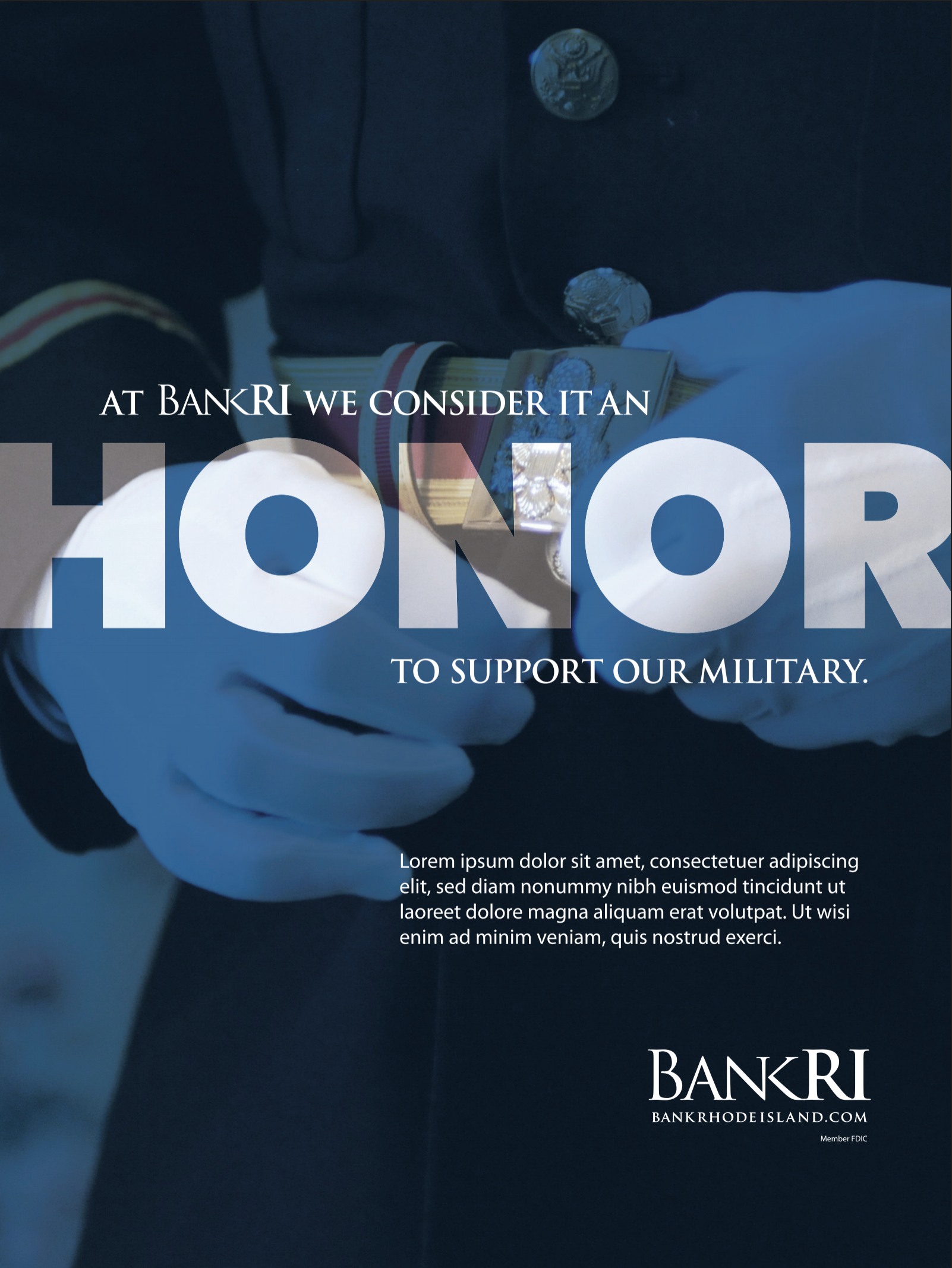
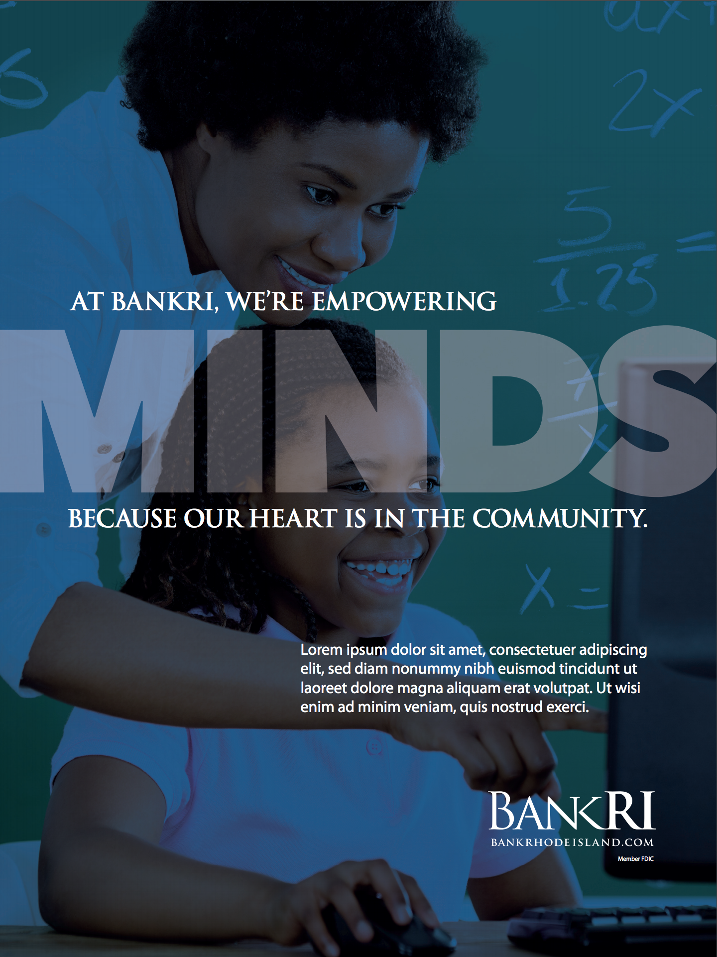
Bank Rhode Island's new advertising campaign designed for community sponsorship and support.
Shark continued BankRI’s 2018 integrated marketing campaign with its newest installation of print media – community ads. A subtle variation on the BIG theme, these ads reinforce the text overlay design concept first introduced by the digital billboard and broadcast TV ads developed by Shark at the beginning of summer. More to come!
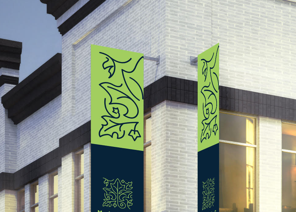
New branding and graphics for an undisclosed national client.
Although we can't name names, we can show a sneak peak at how the central idea of a logo can remain as a central idea with its graphic form evolving. Yes, it's a Maple leaf, that was originally a whole tree. (See below)
Branding a Vermont restaurant and bar.
Just a quick glimpse at some recent design explorations for the Three Penny logo. It's an inherited, client-crafted logo that Shark's design team has reviewed and begun to explore. First thing, cleaner hops, second thing, a more contemporary aesthetic that works beautifully for T-shirts and swag.
Original client-designed logo
Shark's refreshed T-shirt graphic
Some new, "hipster" Three Penny Taproom gift card designs.
Pick a card, any card...
NYC-based Eastern Funding gets a new website.
It was a well-managed migration from the MODX platform to Wordpress, along with a full-landscape, background video, the site includes multiple internal landing pages (under https: which is good for Google, ) and which are designed to integrate with our search, social and digital customer acquisition services.
See it on our development server: http://acqspeed.sharkcomm.com/


