There’s a legacy of branding law firms with multiple partner names. However, multiple attorney names tend to encounter memorable challenges of differentiation and memorability for consumers. We developed 802injured.com and a dedicated phone number, web address, and marketing to counteract these issues for a multi-name client law firm. Following positive results and 802Injured.com’s brand image gaining traction in 2024 through Shark’s marketing, for 2025, we’re expanding 802Injured’s creative and media plan with a newly-developed set of “bookend” 15-second TV spots. The ads feature quirky text-style conversations over de-saturated footage and highlight various practice areas, including Workers’ Compensation and Personal Injury.
Shark rebrands the VCIA with a new logo, tagline, and graphic design system.

Reposted from VCIA:
FOR IMMEDIATE RELEASE: VCIA Launches New Brand and Website as Critical Strategic Year Kicks Off
Sharp, modern logo reflects the members it serves; website now key asset for captive industry.

Burlington, Vermont, January 16th, 2025 – VCIA has launched a comprehensive rebrand, including a new visual identity, tagline and state-of-the-art website (vcia.com), reinforcing its position as community leader in the captive space, and a champion for Vermont’s thriving captive insurance industry.
The new slogan “Captive Excellence Starts Here” emphasizes the inclusive, member-driven arena VCIA sustains for captive insurance professional development and business relations. The future-focused logo signals an innovative ethos akin to the evolving and expanding captive industry.
The centerpiece of this transformation is the launch of a sophisticated new website, designed to serve as a comprehensive resource hub for members and industry professionals. The platform features enhanced functionality including:
- A Captive Media Library featuring the latest on industry trends and emerging risks
- Captives 101, content and resources that demystify captive insurance for newcomers
- An interactive directory of service providers and industry partners
- An advanced AI-driven knowledge assistant, empowering professionals in the captive insurance industry to learn, grow, and innovate. Available later in the year.
"Our new digital platform represents a significant investment in our members' success," said VCIA CEO Kevin Mead. "By providing cutting-edge tools and resources, we're ensuring that Vermont remains at the forefront of captive insurance excellence."
“This brand and website launch is a sign of things to come,” said VCIA Board Chair Gail Newman. “More innovative and relevant strategic initiatives are planned for 2025, providing substantial value, insight and support for organizations to enhance their day-to-day captive operations.”
The rebranding initiative coincides with VCIA’s 40th anniversary which is a celebration and launchpad for the association’s bold future.
On the process of branding: An overview.

It was well back in 2004, when Shark first developed the branding for an innovative new startup based in Montreal, Canada. Under the leadership of Marc Poirier, Acquisio grew into a global search and digital technology services powerhouse, and a decade later, Shark was requested to revisit the company's branding and marketing. What follows is a quick recap and some insight into a branding agency's strategic process which might serve as a template to approach and manage your company's branding and marketing challenges.
BRANDING GOALS - When clients initiate new branding, normally by detailing their business goals and vision, we like to simplify the discussion with some ground rules and goals for successful branding.
Perceiving a difference - Good branding begins with a focus on developing a distinct image in a marketplace. Separating oneself (or company) from the competition - both visually and conceptually - is how consumers can distinguish and hold onto a brand image.
Perceiving Value - While good branding means people can clearly differentiate a name, product or service, great branding is about infusing a sense of perceived value into a brand. With great branding, people perceive a difference and they perceive value which can create brand loyalty, shift products from commodities to premiums and so forth. But before any of the rebranding process could begin for Acquisio, some pressing "11th hour" cleanup of the company's looming Summit provided a preview of things to come and underscores marketing that imparts a sense of value.
Before: After:

BRAND STRATEGY - Good branding agencies generally try to install a singular and objective core strategy to drive the branding process. With Acquisio, it was clear that the company’s marketing typically listed numerous advantages and benefits but was rarely tied to any consistent idea about Acqusio itself. In that list, however, we did uncover one attribute that seems to have more immediate value: Acquisio offered "The Fastest Optimization Algorithm on the Market.” The idea of speed in search and digital obviously had potential as a positioning strategy. We then circulated an article to Acquisio management from Fast Company which noted, "Speed Will Triumph ... The best soccer teams in the world emphasize pace of play over perfection. They recognize that keeping the ball moving quickly is better than waiting and trying to make the ideal pass."
Logo - With speed in mind, the logo was first up for review. Originally designed in 2004 by Peter Jacobs, Shark's Creative Director, the Acquisio logo was composed of three simple bars stacked one over each other. It was an elegant and simple signature that actually pre-dated the same universal “hamburger” logo utilized by responsive websites worldwide. With a design strategy based on “evolution” rather than “revolution,” we preserved much of the Acquisio logo’s original form but modified it into a new, and "faster" look.

DESIGN SYSTEM - A design system is kind of like a brand manager’s tool set. In it you will find a logo, a limited number of fonts, a color palette, specs for layout, the use of images, and pretty much everything that goes in to ensuring a consistent and well integrated brand image. The new Acquisio design system driven by the "speed" strategy was developed simultaneously in brand ads, websites, digital ads and more.

BRAND ARCHITECTURE -To further the strength and consistency of the brand across current and future products and services, Shark developed the brand architecture for naming and branding various sub-brands and service categories. By isolating ACQ in the Acquisio name, we designed an elegant method for connecting Acquisio’s five primary Service Marks: ACQOptimze, ACQReporting, ACQSearch, ACQLocal, ACQPromote.

BRAND STANDARDS - By defining the parameters for typography, color palette, layout, image use, and more, a brand manual provides companies with an organized set of operating instructions for managing the brand in a variety of applications. We created Aquisio's Brand Guidelines to convey the new, integrated vision for the brand, and formatted it in an easy-to-use booklet detailing approved use of typography, color palette, layout, image use, etc. - Acquisio's Design System.

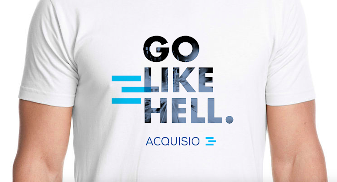
In the end, we sometimes say "it's all about the T." T-shirts are a wonderful test of all things branding - logos, attitude, color, typography, and more. When people willingly wear the symbols or statements of a company they are in effect, validating the merits of the brand. For Acquisio’s first T-shirt, we integrated multiple branding elements into a cool and contemporary expression of the Acquisio’s brand, personality, and positioning.
Outdoor and on-strategy bank marketing.

Shark launches innovative Law firm marketing and branding - 802Injured.com
With a long history in attorney marketing, at Shark, we’ve always viewed the tradition of law firm names as somewhat problematic for consumers to retain and differentiate. While many service organizations in different industries opt for names and brands with an element of simplicity and something more memorable, the tradition of a multiple-last-name brand for a law firm does present obstacles to name recognition and distinction in the marketplace. It’s just not easy for consumers to hold onto multi-syllabic, multi-name ideas or brands. With that said, for the spiffy law firm of Brady | Donahue, we created 802Injured.com to encompass and market their Injury practices including Personal, Workers’ Compensation, Accidents and more. An integrated print, broadcast, and digital marketing program is in place along with this 15 second spot designed for streaming media.
Samples from a beautiful banner and digital marketing program we launched in 2023.


Just a note on branding.

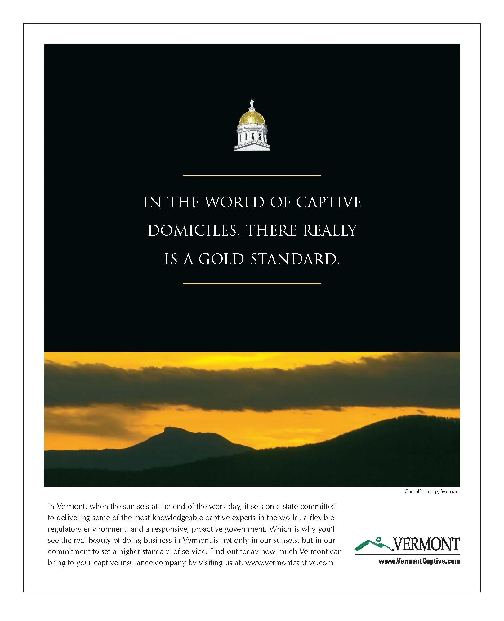
Some Captive Insurance ads - vintage but on point.
After Shark established a “Gold Standard,” strategy for Vermont Captive Insurance, this is the ad that launched a campaign that as we say in advertising, would prove to have “legs.”


Creative Bank marketing with a new 30 Second Broadcast TV for Bank Rhode Island.
A nifty little spot developed around the bank’s new “financial Strength and Trust,” strategy.
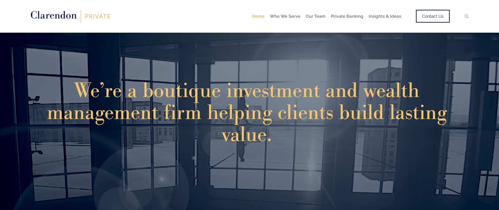
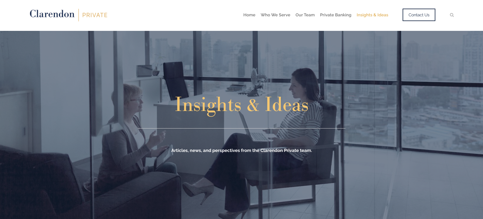
Clarendon Private, Boston Wealth Management design and advertising by Shark.

Clarendon Private, a Boston Wealth Management firm gets new creative from Shark.
Launched in 2021, Clarendon Private is a Boston-based Wealth Management and Private Banking firm. Shark created the branding, design, and website which communicate Clarendon Private’s sophisticated services for its high net worth clientele. This initial ad is the first in a series of new ads developed by Shark that are designed to augment the company’s “brand” visibility. The marketing program is heavily skewed towards digital media with some traditional print and broadcast media possible later in 2023.

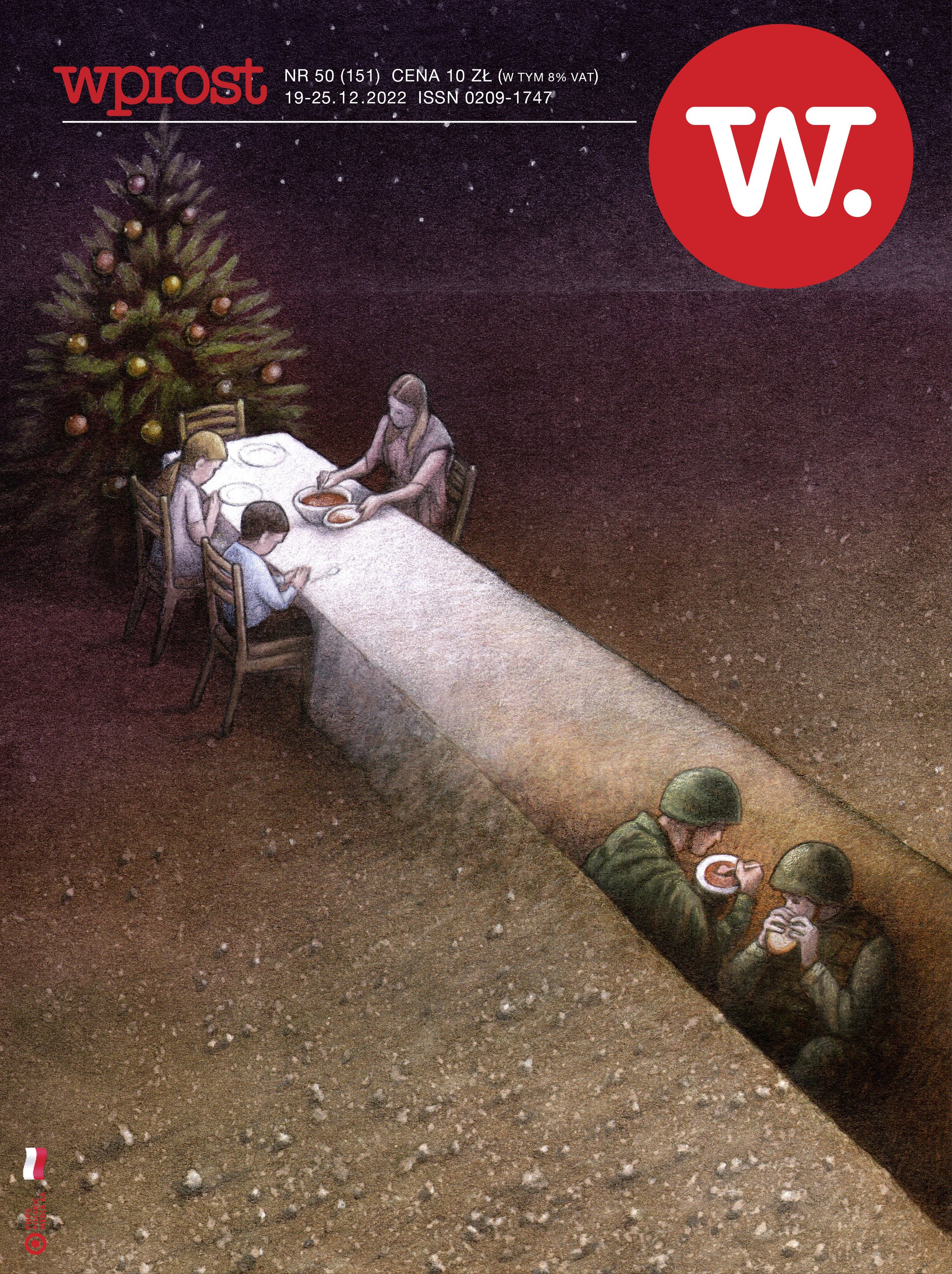
Piękny. In defense of Ukraine from Poland.
Piękny. Our congrats on beautiful, creative and conceptual illustration from WProst Polish media.

On deck: A new creative bank advertising campaign takes shape with a first ad.
Bank Rhode Island is getting a new brand advertising campaign from Shark. Built around the campaign theme “Banking, Well-Crafted,” the first ad features the beauty and craftsmanship of a yacht’s teak deck. The personal attention and hands-on commitment to quality provides a conceptual foundation to support the bank’s more personalized, customer-focused style of banking. It’s sophisticated bank branding and bank advertising that’s becoming more rare these days.

Vermont's best branding and web design - right here from Shark.
Coming soon, an elegant new logo, branding, and a bright and beautiful new website design for master craftsman, Alex Mckenzie.


Any Ukrainian Word Press Developers available? українські програмісти?

We really want to help and we do need a trusted, go-to web developer and programmer. End of story.
Just a quick addition to Bank Rhode Island's branch office marketing.
This quickly developed - but nicely conceived and designed “teller line” poster integrates with Bank Rhode Island’s current branch office communications. There was a brief but lively creative debate within the often pesky BankRI marketing team, but all is settled. I think …

#United for Ukraine

Beautiful new financial services branding and website design.
A few images highlighting our development of a logo, website, design system, and overall sophisticated brand image for Clarendon | Private. The Boston-based Wealth Management firm serves high net-worth clients and enjoyed a successful late 2021 launch. (With Shark’s help, of course).

Some vintage restaurant ads from the '80s.
With a little bit of office cleaning, out from under a pile of stuff came these original restaurant ads for Cappy’s in Camden, Maine. Hand-drawn illustrations by West Palm Beach, Florida artist Richard Jacobs along with hand-drawn typography,


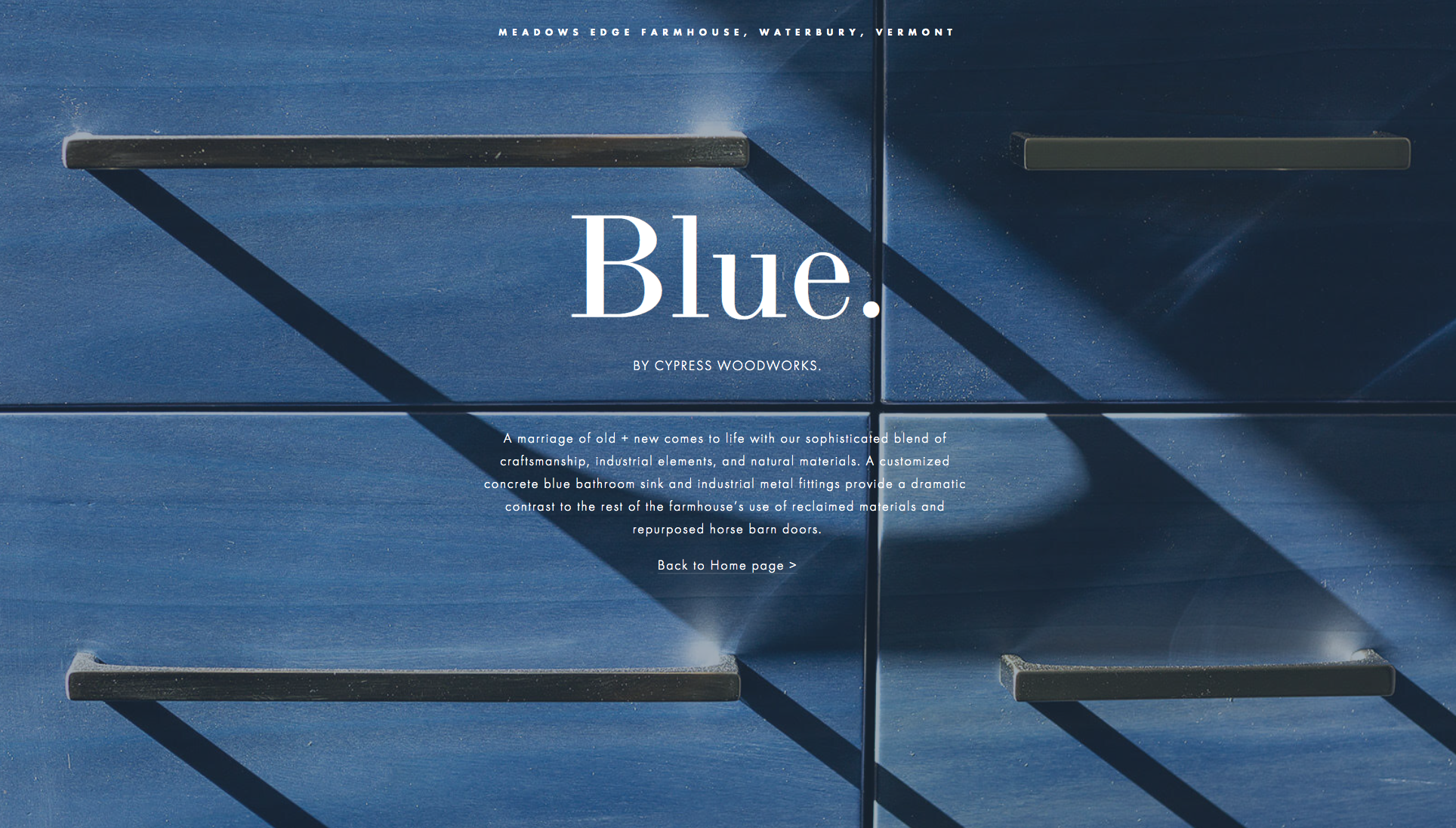
Blue - beautiful web design and an elegant web showcase featuring the work of Cypress Woodworks.
With his company, Cypress Woodworks, fourth-generation Vermont woodworker Alex McKenzie continues a family legacy of beautiful residential construction, fine woodworking, and master craftsmanship. When Shark Communications’ web design team received a new set of photographs for a recent project titled “The Meadows Edge Farmhouse,” we decided to design a small visual web showcase within the company’s current website to specifically feature Alex’s exquisite work for one of the home’s new bathrooms. Titled “Blue,” you can see it here >